GRAPHIC DESIGNER

kiari
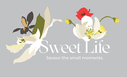
season launch
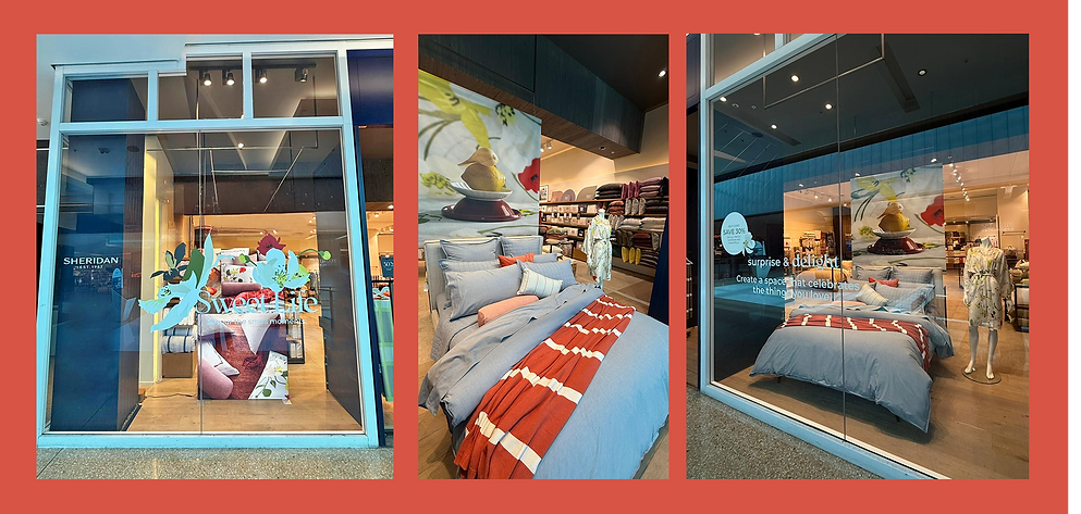
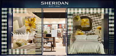
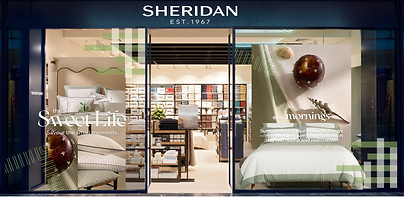
Kiari launched SS25 with a sense of spring romance and optimism. Its delicate floral print inspired the first interpretation of the lock-up, where blossoms were woven directly into the typography. This created a window that felt light, fresh, and celebratory — perfectly aligned with the campaign’s call to savour the simple pleasures of the season. Kiari set the tone for The Sweet Life, embodying those first balmy days filled with possibility and renewal.
HERO LOCKUP
DISPLAY FONT:
ARSENICA VARIABLE
DISPLAY MEDIUM
ITALIC
BRAND FONT: MONTSERRAT
SECONDARY LOCKUP
DISPLAY FONT:
ARSENICA VARIABLE
DEMI BOLD
BRAND FONT:
MONTSERRAT


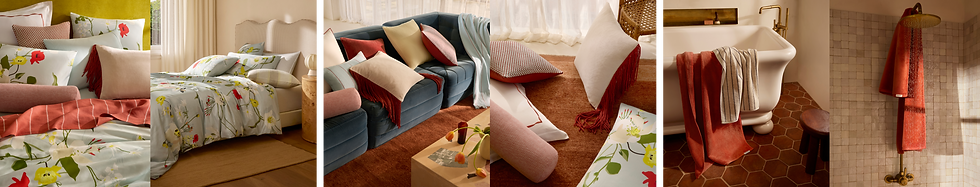
romi check &
reframed
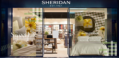
Later in the season, Romi Check and Reframed were introduced as the new hero beds. The decals had to work for both at once, so I designed a split treatment: half gingham to reflect Romi’s bold check, and half fine-line detail to reference Reframed’s tailored trim. While partly driven by budget restraints, this solution also tied neatly into the SS25 direction — bedding designed to be mixed and matched rather than sticking to one look. The result was a window that felt cohesive while still letting each product’s character come through.
HERO LOCKUP
DISPLAY FONT:
ARSENICA VARIABLE
DISPLAY MEDIUM
ITALIC
BRAND FONT: MONTSERRAT
SECONDARY LOCKUP
DISPLAY FONT:
ARSENICA VARIABLE
DEMI BOLD
BRAND FONT:
MONTSERRAT
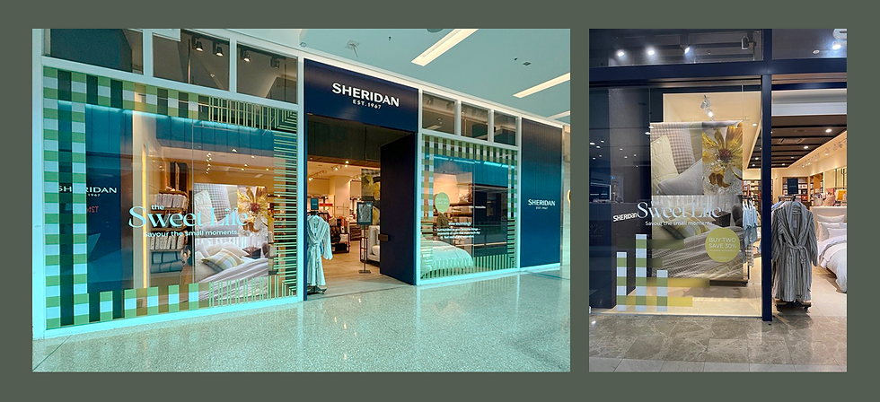
ELEVATED STORES
ROMI CHECK
REFRAMED

Elevated stores: Professional installers are used for Sheridan Flagship stores so more complex applications can be used. For these stores, I created full border decals featuring bold gingham and fine-line detailing that wrapped the windows, making a strong seasonal statement.
ALL STORES
ROMI CHECK
REFRAMED
Self-install stores: Our non-flagship stores require the store teams to self install creating the need for a simpler solution they can apply themselves. I reworked the design into an abstract system of gingham blocks and angled line details — a pared-back version that still echoed the product stories, but was achievable within the practical limitations of a self-install.