GRAPHIC DESIGNER
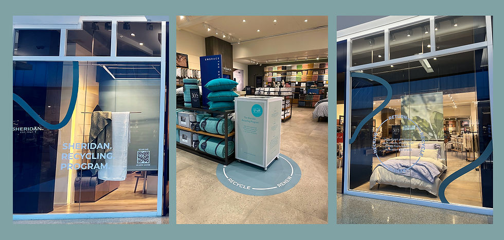
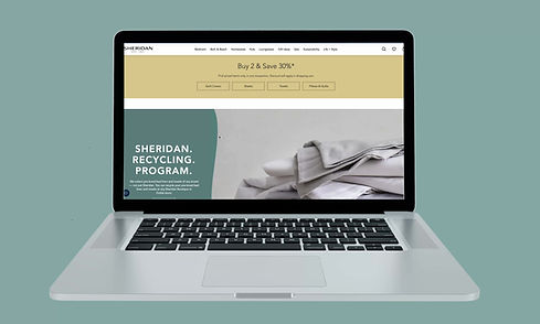
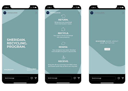
sheridan recycling program
For the Sheridan Recycling Program, I refreshed the window display to communicate the cycle of Return. Recycle. Renew. Receive. Working with a very limited budget and a library of older photography, I elevated the design through colour, typography, and layout.
Using a calm, sustainability-inspired palette of muted teal, seafoam grey, and white, I introduced flowing wave graphics and a circular lockup to represent the recycling loop. The result was a window that felt premium yet purposeful, aligning with Sheridan’s brand values while encouraging customer engagement in-store.
CAMPAIGN CREATIVE DIGITAL TYPOGRAPHY
HERO LOCKUP
BRAND FONT IN 2023: AVENIER
SECONDARY LOCKUP

ICONS
BRAND FONT IN 2023: AVENIER


the concept
To avoid a purely functional or corporate look, I introduced organic, flowing shapes throughout the design. These soft, curved forms were inspired by natural elements — such as rippling water, fabric in motion, and the cyclical flow of renewal — aligning thematically with Sheridan’s sustainability message.
The shapes added visual interest and movement to the window while breaking up rigid blocks of text and imagery.
ELEVATED STORES
ALL STORES

Elevated stores: Professional installers are used for Sheridan Flagship stores so more complex applications can be used.
Self-install stores: Our non-flagship stores require the store teams to self install creating the need for a simpler solution they can apply themselves. I reworked the organic shape into the banner art so that the self install stores still had this element to the visual storytelling.